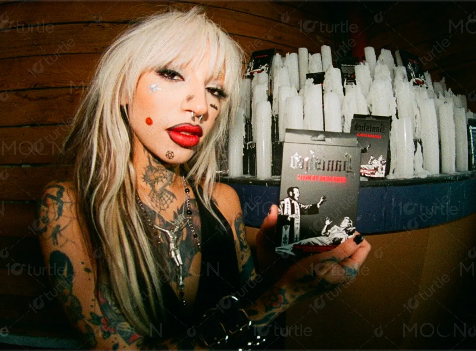
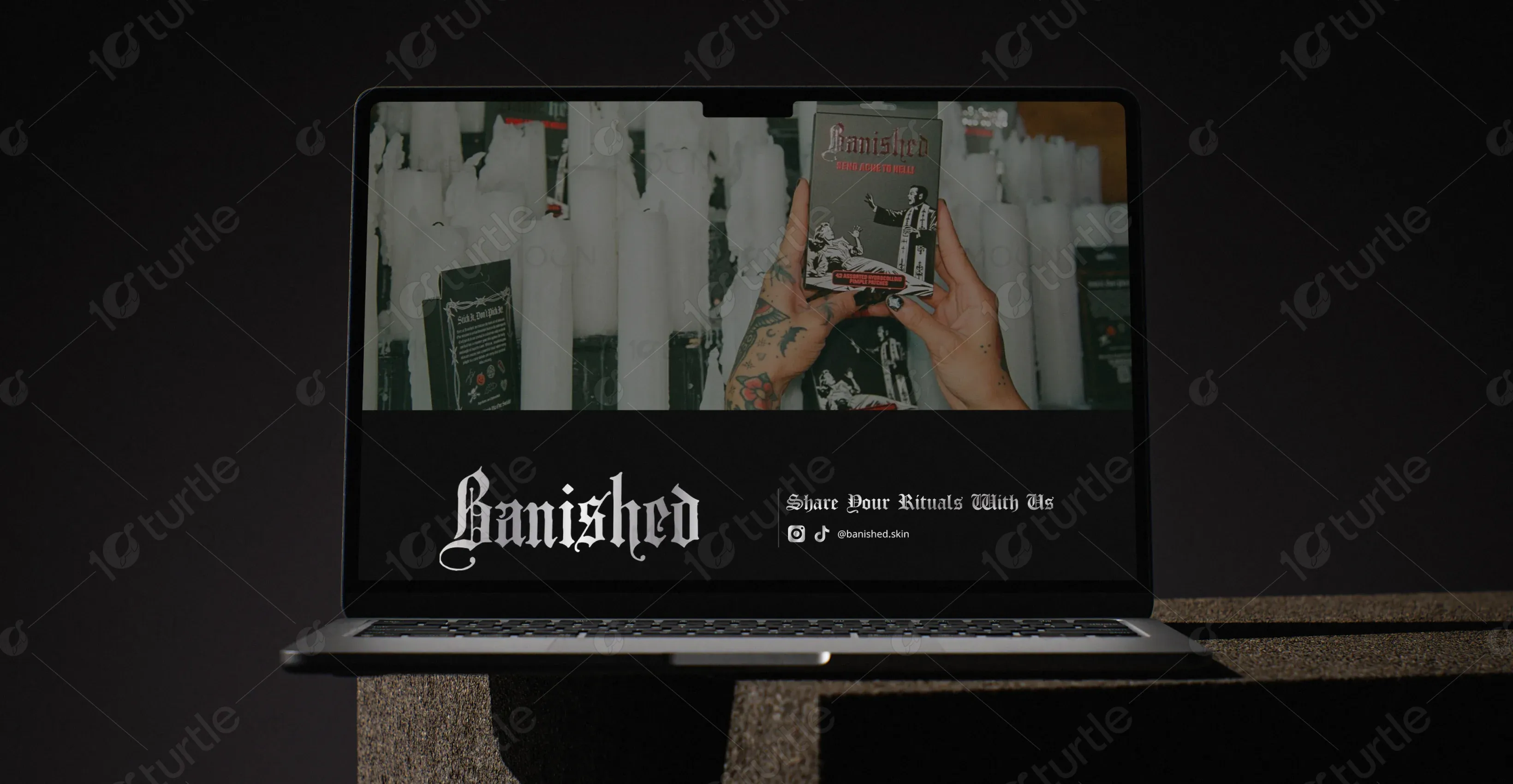
Banished – Send Acne to Hell. This bold and irreverent skincare brand is dedicated to transforming the daily ritual of blemish control into a gothic, tongue-in-cheek ceremony. Banished creates targeted skincare patches designed to banish pimples back to the underworld with a blend of efficacy and darkly playful branding that resonates with an audience tired of sterile, clinical beauty products.
UX Design
UI Design
Research
Websites Design
Industry
Beauty & Personal Care
Tools we used

Project Completion
2024
The project aimed to build an e-commerce platform that showcased Banished’s unique product line while immersing visitors in the brand’s moody, otherworldly atmosphere. The client wanted a site that would immediately stand out in the saturated skincare market, spark curiosity, and foster a sense of belonging among fans who share the brand’s darkly humorous worldview.
Industry
Beauty & Personal CareWhat we did
User ResearchUI UX DesigningResponsive ExperiencePlatform
-Traditional skincare brands often rely on clean, minimalist visuals that convey sterility and perfection but lack personality. Banished needed to overcome the challenge of standing out without alienating potential customers seeking credible results. The project required striking the right balance between edgy, unconventional branding and the reassurance that these products are scientifically effective.
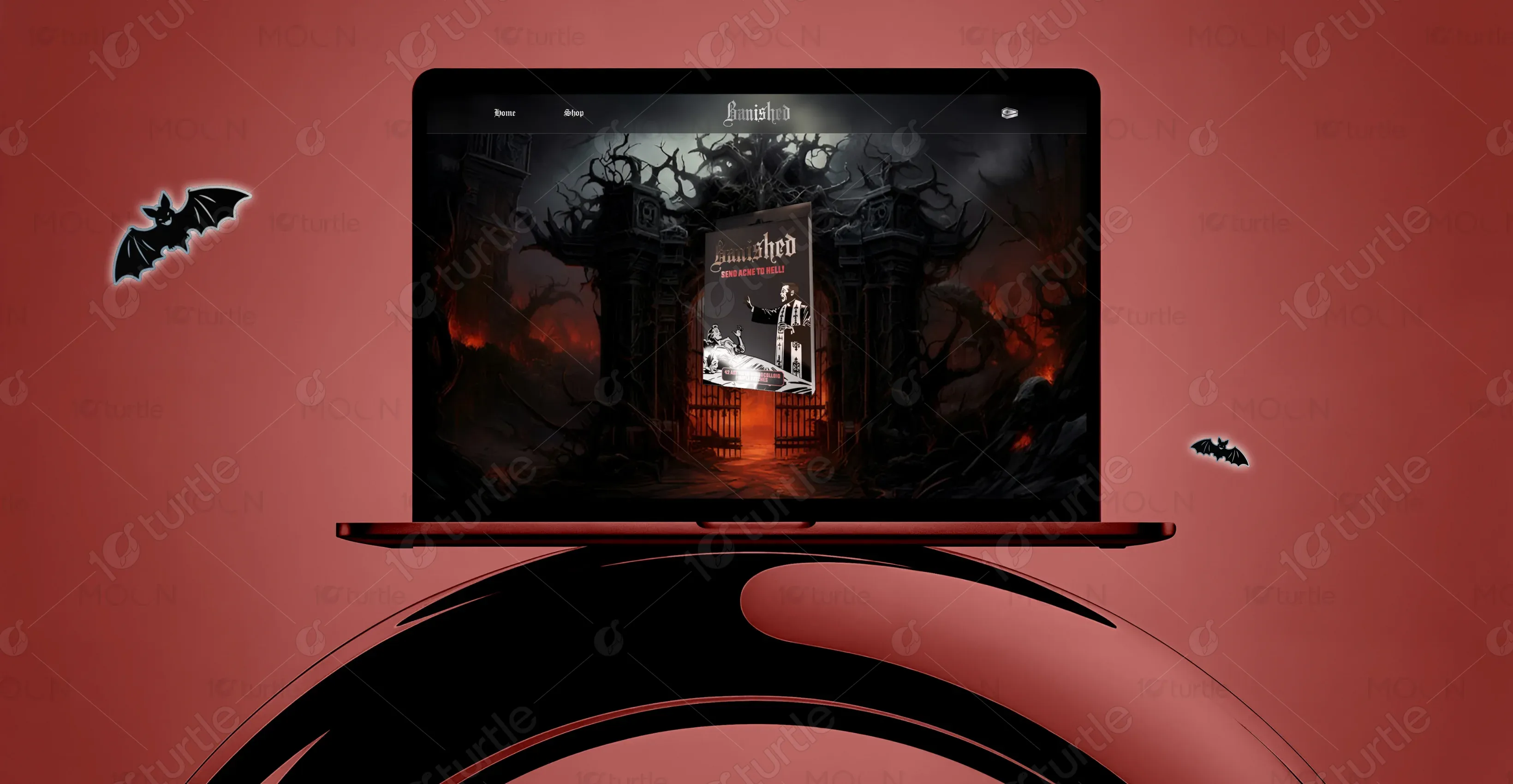
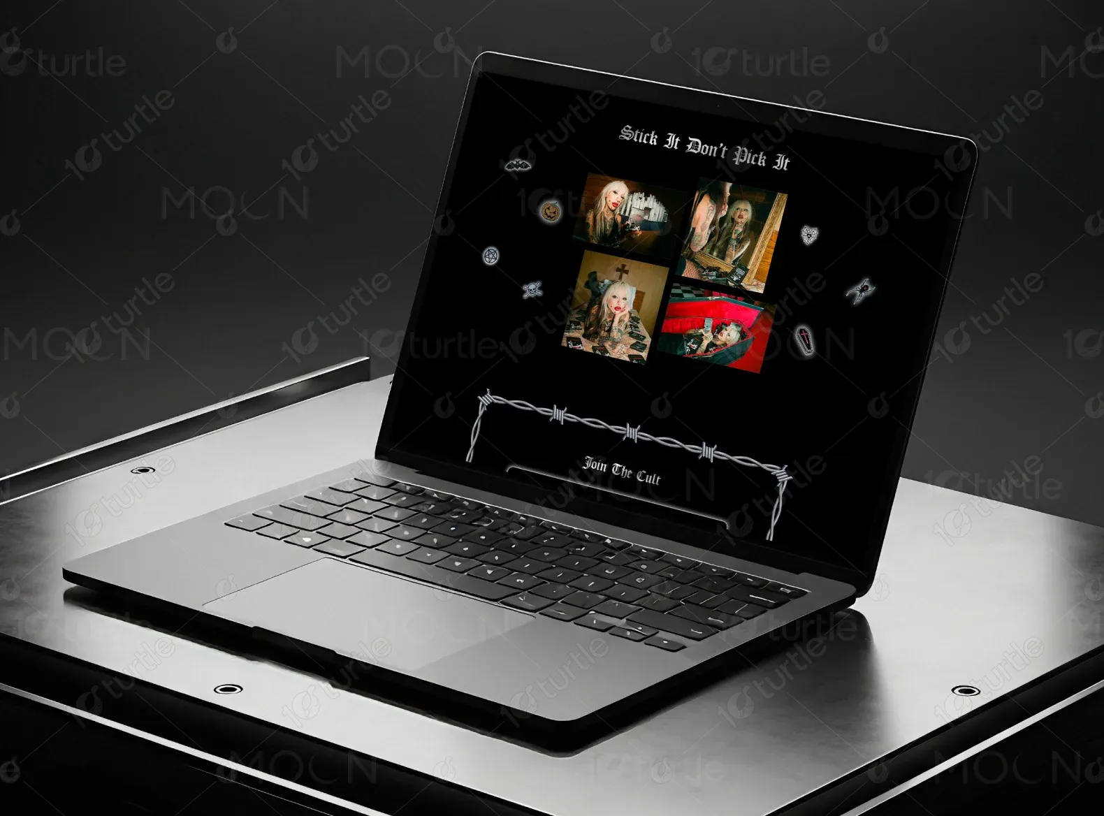
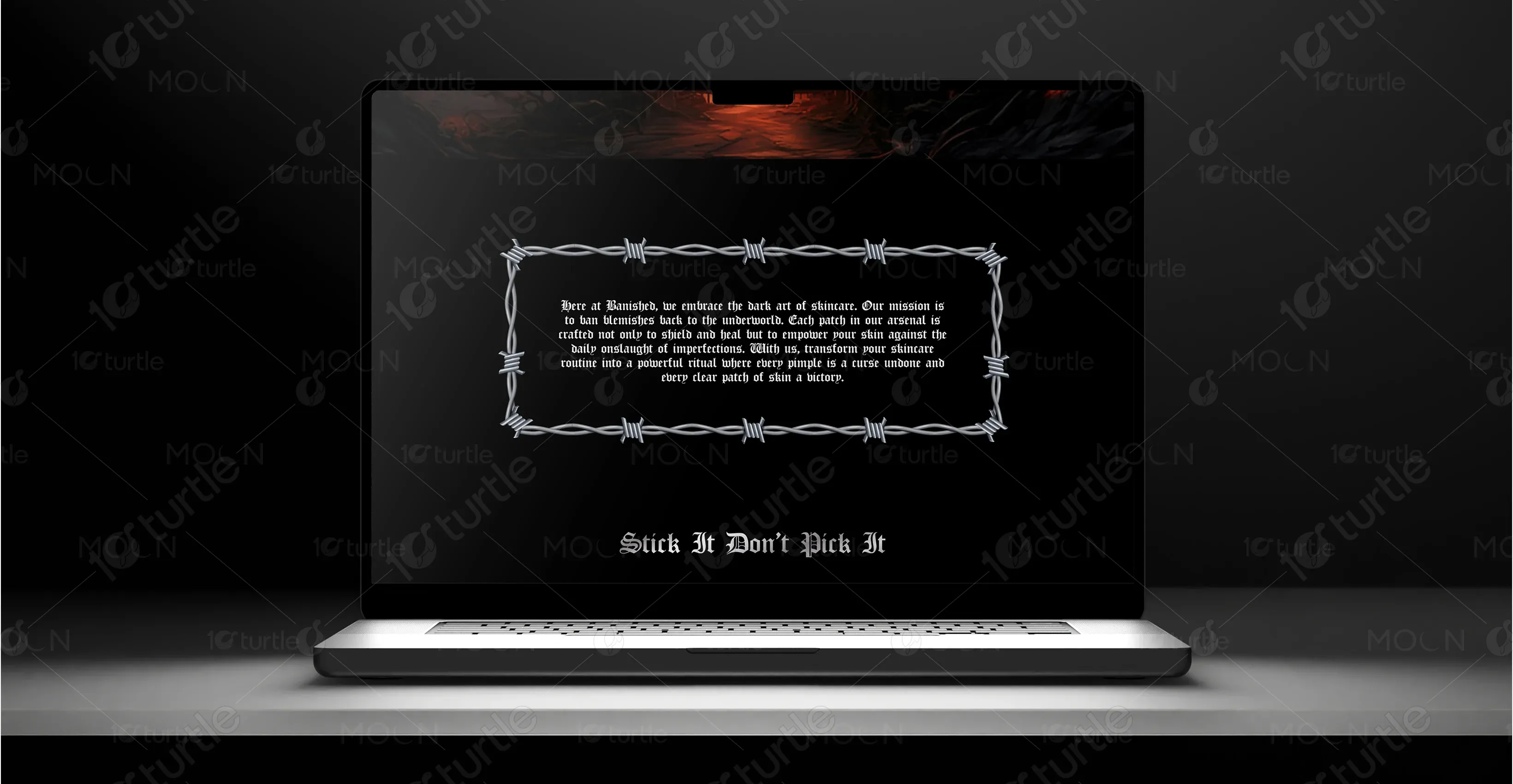
The solution was to create a dark, immersive website that reflects Banished’s rebellious, gothic identity through bold visuals and occult-inspired typography. Key sections like “Stick It Don’t Pick It” and “Join the Cult” pull users into the brand story. Simple navigation and strong CTAs ensure a seamless path to conversion.
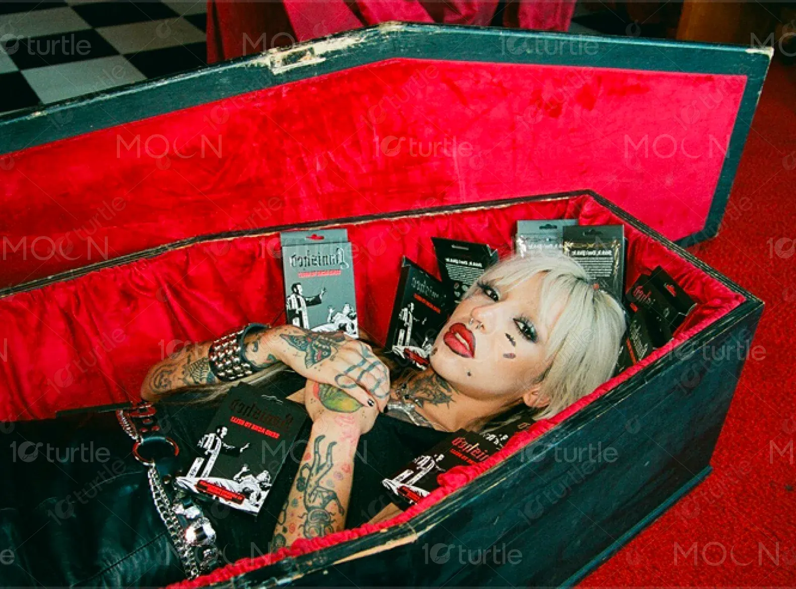
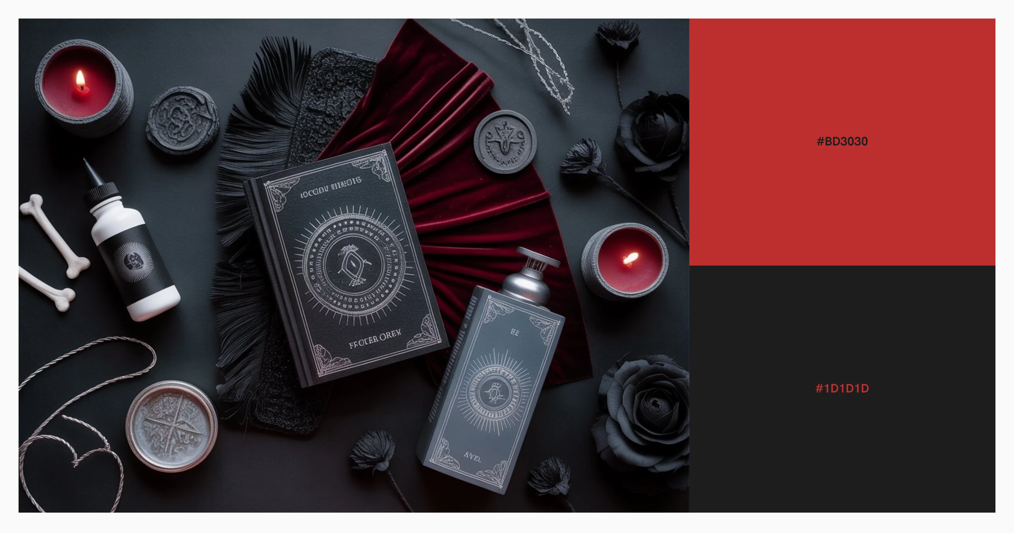
The client envisioned a dark, rebellious aesthetic inspired by heavy metal, horror, and tattoo culture. Gothic typography, barbed wire frames, and occult symbols conveyed their anti-mainstream attitude. Referencing brands like Killstar and Blackcraft Cult, the site was designed to feel exclusive and unapologetically bold.

The Banished logo is rendered in a gothic blackletter typeface that recalls medieval script and vintage horror posters. Its spiked, ornamental flourishes evoke ritualistic symbolism and the rebellious spirit of underground counterculture. The design is stark and memorable, instantly conveying the brand’s defiant positioning while maintaining legibility across digital and print applications.
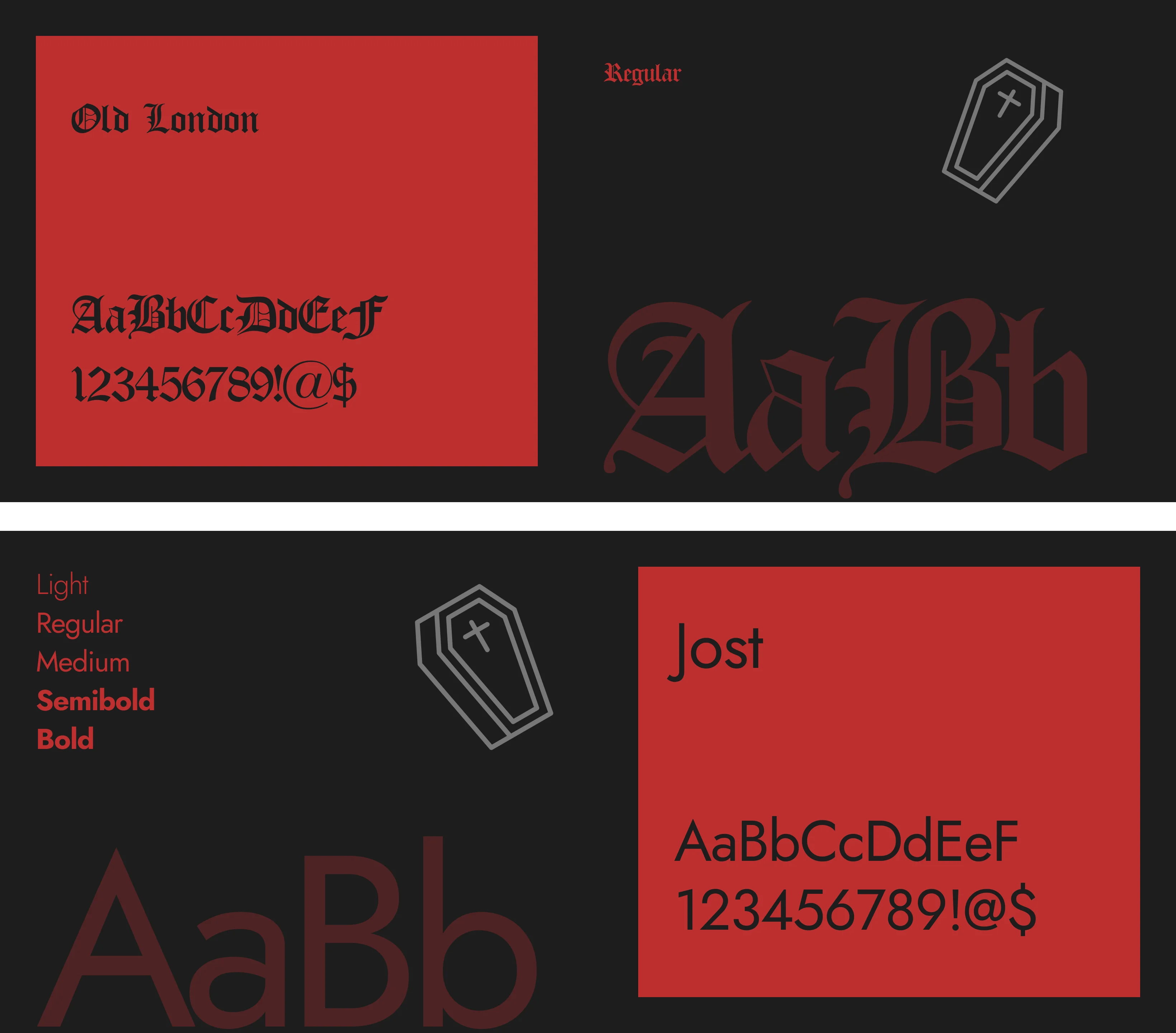
The color palette is dominated by deep black, and blood red accents. Black serves as the primary background to evoke a sense of mystery and drama, while red highlights inject energy and urgency into calls to action and promotional banners. Occasional white text provides stark contrast for maximum readability.
Initial wireframes mapped out a simple vertical flow anchored by a striking hero area, an explanatory section about the brand’s mission, a product showcase, a visual gallery, and an email opt-in. The wireframe emphasized a single scrolling page to create a contained, theatrical experience rather than a fragmented, multi-page site. This approach allowed the story to unfold like a ritual from beginning to end.